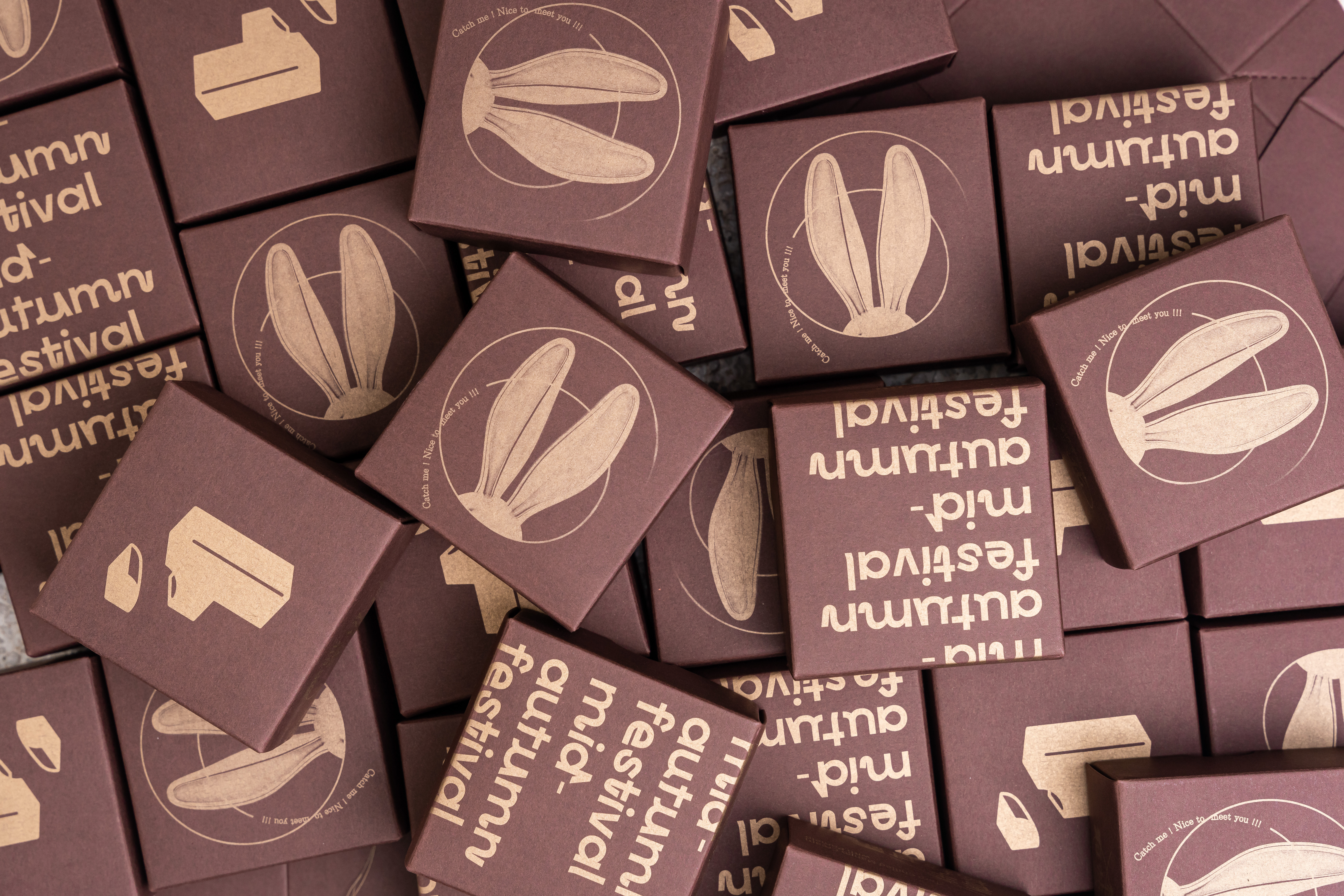

....
......
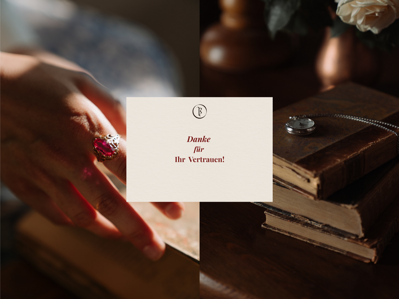
Bücherfreund is approximately translated from German as "book lover". He is a third-generation bookbinder who does his work in traditions received from his parents and grandparents.
A logo should embody authenticity, 19th century mood and convey the idea of handicraft.
A logo should embody authenticity, 19th century mood and convey the idea of handicraft.
Idea
Gothic font was used widely in Germany until the mid 20th century, so I created blackletter-like letters which closely resemble that font. Each letter flows into the other and all letters are closely connected like book sheets with thread which symbolizes carefulness and handmade work.
Gothic font was used widely in Germany until the mid 20th century, so I created blackletter-like letters which closely resemble that font. Each letter flows into the other and all letters are closely connected like book sheets with thread which symbolizes carefulness and handmade work.
Apart from main logotype version, alternative ones were created. The round submark is perfect for stamps, wax seals and creating a pattern, certainly.
.....
....


....
....


....
....
"For the love of books"
....
.....


/////


